


Introduction
Jif peanut butter branding is getting its biggest makeover in more than three decades, and the change is about more than making the jar look newer.
Jif, owned by The J.M. Smucker Co., has unveiled a refreshed visual identity that modernizes its familiar red, blue and green branding while pushing the product into a wider range of snacking occasions. The update arrives alongside a new campaign called “Every Jif’ing Thing,” which shows peanut butter being used in everything from dips and smoothies to pasta dishes.
The timing is notable. The supplied Google Trends screenshot shows a sharp burst of searches for “new jif peanut butter branding,” suggesting that consumers are paying attention to a packaging and marketing change involving one of America’s most recognizable food brands.
And there is one detail longtime Jif buyers will probably appreciate: the recipe is not changing.
Background and Context
Jif’s familiar visual identity has been sitting on grocery shelves for more than 30 years with remarkably little disruption.
That makes the company’s decision to redesign the brand significant.
According to The J.M. Smucker Co., the refresh is designed to preserve the elements consumers recognize while giving the brand a cleaner, bolder appearance that works across physical shelves and digital environments.
Allrecipes reported that Jif’s tri-color logo had remained essentially untouched for more than three decades before this update. The new packaging uses bolder colors, a more readable logo and front-of-pack imagery intended to suggest additional ways to use the product.
That last point is crucial.
Jif is not simply redesigning the jar. It is trying to redesign the way consumers think about peanut butter.
For generations, the product has been closely associated with peanut butter and jelly sandwiches. Jif now wants consumers to see it as a flexible ingredient and snack in its own right.
Latest Update: Jif Unveils New Branding and Packaging
The new Jif peanut butter branding removes the dated drop shadow from the letters in the company’s signature tri-color banner.
The result is a cleaner visual treatment that retains the recognizable red, blue and green identity while making the brandmark feel more contemporary.
New packaging also features imagery designed to highlight different snack occasions.
Jif says the updated look will begin shipping to stores in October 2026, with the new packaging expected to reach shelves in waves throughout the fall and early winter.
For shoppers, the transition should therefore happen gradually rather than overnight.
And there is no formula change hiding behind the redesign.
The company says the Jif portfolio will continue to offer the same taste consumers know.
Read the full Jif brand announcement on PR Newswire
The Bigger Move: Jif Wants to Escape the PB&J Box
The most interesting part of the announcement is not the logo.
It is the strategy behind it.
Marketing Dive reports that Jif’s peanut butter currently appears in just 4% of total snacking occasions, according to data shared by the company. That gives the brand a considerable opportunity if it can convince consumers to use peanut butter in more situations.
The new “Every Jif’ing Thing” campaign is built around exactly that idea.
A 60-second hero advertisement reimagines the familiar Jif logo as actions including “dip,” “sip” and “mix.” The campaign presents peanut butter as an ingredient for smoothies, protein bowls, pasta and other foods rather than treating it exclusively as the middle layer of a sandwich.
The creative approach is deliberately playful.
The campaign uses a remixed version of “O Fortuna,” transforming the famously dramatic classical composition into an unexpectedly grand soundtrack for peanut butter.
That contrast is part of the point.
Jif is taking something consumers already know extremely well and giving it a more surprising context.
Expert Analysis: Why Jif Is Changing a Familiar Brand
Brand refreshes are risky, particularly when the existing identity is already recognizable.
Marketing Dive reports that 85% of consumers could recognize Jif’s logo by its red, blue and green stripes, according to company-shared research. But those same consumers largely associate the brand with peanut butter and jelly sandwiches.
That creates a branding paradox.
Recognition is valuable, but recognition alone does not guarantee growth.
If consumers immediately recognize a product but only think of one use for it, the brand may be leaving potential demand on the table.
Jif’s solution is not to throw away its visual identity.
It is to make the existing identity do more work.
The three-letter mark and tri-color system remain recognizable, while the refreshed packaging and advertising attach those assets to additional behaviors.
In marketing terms, Jif is attempting to expand the mental category around the product without abandoning the equity it has built over decades.
Why the Logo Matters More Than It Looks
A logo redesign can seem superficial when the underlying product remains unchanged.
In Jif’s case, however, the logo is being used as a strategic device.
The campaign takes the recognizable visual structure and turns it into a visual vocabulary for different ways of eating peanut butter. Marketing Dive describes the brandmark appearing in contexts tied to dipping, snacking, smoothies, protein bowls and pasta.
That gives the logo a new job.
Instead of simply saying “this is Jif,” the visual identity begins to communicate “this is what Jif can do.”
That distinction matters in a crowded consumer packaged goods market where growth often depends on finding new consumption occasions rather than simply convincing existing buyers to purchase the same product more frequently.
The Packaging Is Becoming a Marketing Channel
The new jars are also designed to communicate usage ideas directly at the point of purchase.
Allrecipes reports that the refreshed packaging includes new imagery and snack ideas intended to inspire consumers to use Jif in different ways.
That turns the package into something closer to a miniature advertising platform.
A consumer standing in a grocery aisle does not necessarily need another explanation of what peanut butter is.
What they may need is a reason to buy it for something other than a sandwich.
Showing an alternative use directly on the jar can shorten that gap between awareness and experimentation.
It also creates consistency between the product itself and the advertising campaign.
The message is no longer confined to a television commercial or social media post. It follows the product into the kitchen.
Jif Is Also Expanding Product Formats
The branding refresh arrives alongside product changes that support the broader snacking strategy.
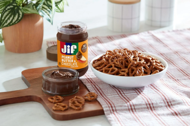
Jif is introducing squeezable formats, while products such as Jif Peanut Butter & Chocolate Flavored Spread and Jif Simply Peanut Butter Spread expand the range of ways consumers can use the brand.
Jif To Go is also being renamed Jif Dippers, a change intended to make the product’s dipping use case more immediately obvious.
That suggests the refresh is not simply a cosmetic project.
The visual identity, advertising, packaging and product formats are all moving in the same direction.
The brand wants consumers to see peanut butter as portable, flexible and snackable.
Broader Implications
For Consumer Brands
Jif’s move illustrates a broader challenge facing established consumer brands.
Legacy recognition is valuable, but it can also become restrictive.
When a brand has been associated with one dominant use for decades, consumers can unconsciously place it into a narrow mental category.
Changing that perception requires more than a new advertisement.
Jif is attempting to coordinate packaging, product formats, social content and visual identity around the same message.
That makes the refresh more strategically significant than a typical logo update.
For Digital Marketing
The campaign is also designed for a fragmented media environment.
Marketing Dive reports that “Every Jif’ing Thing” will run across broadcast, streaming, online video, Meta, TikTok and Pinterest.
That mix reflects how major consumer brands now have to operate.
A campaign needs to work in traditional television advertising while also generating visual and social formats that can travel across short-form video and creator-driven platforms.
Jif’s use of content creators in the campaign reinforces that shift.
For The J.M. Smucker Co.
The investment also comes as Smucker increases its broader marketing spending.
Marketing Dive reported that the company expects to spend about 5.7% of net sales, or nearly $500 million, on marketing in fiscal 2027.
The Jif refresh is therefore arriving within a larger effort to support the company’s brand portfolio.
For marketers, that makes the campaign worth watching beyond the peanut butter aisle.
For The Tech Marketer Audience
The technology angle is increasingly obvious.
Modern branding is no longer limited to packaging and television. A single identity has to work across e-commerce thumbnails, social feeds, creator videos, mobile advertising, retail platforms and physical shelves.
Jif’s redesign is a useful case study in how legacy consumer brands adapt visual systems for a digital-first environment.
For more coverage of technology, marketing and digital business, visit The Tech Marketer.
Related History and Comparable Brand Refreshes
Jif is not the first established consumer brand to face the tension between recognition and relevance.
Major brands routinely refresh their visual identities when they believe their existing design no longer communicates the full range of what they offer.
The difficult part is knowing what to preserve.
Jif appears to have chosen a conservative approach.
It kept the recognizable tri-color banner rather than replacing it with an entirely new identity. It removed the drop shadow, modernized the presentation and expanded the imagery surrounding the product.
That is essentially an evolution rather than a reinvention.
For a brand with decades of accumulated recognition, that may be the safer strategy.
What Happens Next
Consumers should begin seeing the new Jif packaging in stores starting in October 2026, with the rollout continuing through the fall and early winter.
The real test will not be whether shoppers notice the new jars.
They almost certainly will.
The more important question is whether consumers actually start using peanut butter in more ways.
If Jif can move from being primarily associated with PB&J sandwiches to becoming a more general snack and ingredient, the redesign will have accomplished something much more valuable than refreshing a logo.
It will have expanded the brand’s addressable consumption occasions.
The “Every Jif’ing Thing” campaign is designed to make that happen by showing consumers recipes, snack ideas and unexpected uses across multiple media channels.
That means the next phase of the story will play out in kitchens, grocery aisles and social feeds.
Conclusion
The latest Jif peanut butter branding refresh is a reminder that even the most recognizable consumer brands eventually have to answer a basic question: what else can we be?
Jif has spent more than 30 years building equity around its familiar logo and the peanut butter and jelly sandwich.
Now it wants to broaden that association.
The refreshed packaging keeps the recognizable red, blue and green identity but gives it a cleaner treatment. New imagery highlights additional snack ideas, while squeezable formats and products such as Jif Dippers support the brand’s push beyond the traditional sandwich.
The accompanying “Every Jif’ing Thing” campaign takes that strategy even further, using social media, streaming, television and creator content to demonstrate how peanut butter can fit into more parts of everyday eating.
The product itself is staying the same.
The positioning is not.
And that may be the most important change of all.
FAQ
What is changing about Jif peanut butter branding?
Jif is introducing its first major visual identity update in more than 30 years. The redesign modernizes the tri-color logo, removes its dated drop shadow and adds new packaging imagery focused on broader snacking occasions.
Is Jif changing its peanut butter formula?
No. The company says the refreshed packaging does not change the products’ taste or formulas.
When will the new Jif packaging appear in stores?
New packaging begins shipping in October 2026 and is expected to reach store shelves in waves throughout the fall and early winter.
Why is Jif changing its branding?
Jif says it wants the brand to better reflect how consumers use peanut butter today, including everyday snacking occasions beyond the traditional PB&J.
What is the “Every Jif’ing Thing” campaign?
It is Jif’s new marketing campaign demonstrating different ways to use peanut butter beyond sandwiches. The campaign includes television, streaming, online video, Meta, TikTok and Pinterest.
What does the new Jif logo look like?
The updated identity retains Jif’s recognizable red, blue and green color system but removes the dated drop shadow and gives the lettering a cleaner, bolder appearance.
Is Jif introducing new products with the branding refresh?
Yes. Jif is highlighting squeezable formats and products including Jif Peanut Butter & Chocolate Flavored Spread and Jif Simply Peanut Butter Spread. Jif To Go is also becoming Jif Dippers.
Why is the Jif branding update trending?
The supplied Google Trends screenshot shows a noticeable increase in searches for “new jif peanut butter branding.” The spike coincides with coverage of the brand refresh, new packaging and campaign launch.
SOURCES & REFERENCES
- Allrecipes, “Jif Is Changing Its Fan-Loved Peanut Butter for the First Time in Over 30 Years”
Read the Allrecipes report - Marketing Dive, “Jif’s new campaign reworks logo to go beyond peanut butter and jelly”
Read the Marketing Dive report - PR Newswire, “Jif Unveils First Major Brand Refresh in More than 30 Years as Peanut Butter Moves Beyond the PB&J”
Read the J.M. Smucker announcement